Mental Health
Mindflow
ux-design
user research
ui-design
Overview
A digital companion that supports people with diagnosed anxiety between sessions by turning everyday experiences into structured, shareable signals for them and their therapists.
Tools
Figma, Miro, Pen & Paper, Lyssna, BallparkHQ, Optimal Workshop, After Effects, Photoshop, Illustrator
Duration
6 months
Outcomes at a glance
Turned a vague “anxiety app” idea into a clinically anchored companion that complements, rather than replaces, therapy.
Defined and prioritized a focused feature set around three high‑stakes moments: daily tracking, pattern insight, and acute crisis support.
Designed and evaluated an end‑to‑end prototype with seven participants; task success ranged from 5/7 to 7/7 with satisfaction around 7–8/10, directly informing concrete improvements to key flows.
Used my decade of lived experience with generalized anxiety to build trust and rapport in research and testing, while keeping decisions grounded in participants’ needs and clinical input.
Evolved the interface and interaction patterns to lower cognitive load through simplified flows, clearer semantics, and a calming visual and language system tailored to users with anxiety.
Challenge
People living with anxiety disorders face unpredictable symptoms, unclear triggers, and long waiting times for therapy, often without reliable day‑to‑day support.
Even in therapy, memory gaps and unstructured notes make it hard to communicate patterns and progress.
Many existing “wellness” apps are either too shallow to be clinically useful or too complex to feel safe in moments of distress.
The core tension was designing a tool that feels emotionally supportive in the moment while remaining precise and credible enough to be genuinely useful in therapy conversations.
Objective
In six months, design and evaluate a digital product for people with diagnosed anxiety that helps them systematically track their mental state, recognize meaningful patterns, and access immediate self‑help, while producing records therapists can understand and work with.
Deliver a handoff‑ready prototype, plus a clear, research‑based roadmap for improving critical flows.

Solution
Mindflow is a companion app that structures everyday experiences of anxiety into simple logs, clinically informed assessments, and guided self‑care workflows.
It shifts from generic “mood logging” to meaningful indicators, from scattered, personal notes to standardized records, and from generic advice to context‑sensitive support during early or acute episodes.
The product is clearly positioned as a therapy aid, not a replacement, aligning expectations with both users and professionals.
Mindflow


Simple
The design emphasizes simplicity creating a calm and manageable user experience, enabling users to navigate Mindflow with ease and confidence.
Clear
Clear typography and a soothing color palette improve readability and reduce visual stress, so key content stays easy to grasp.
Structured
Visual aids and consistent structure turn scattered experiences into records that are easier to understand, recall, and share.
Supportive
Direct, non‑judgmental language and supportive messaging help users feel seen while they manage difficult moments.
Outcomes & impact
Clarified Mindflow’s role as “therapy aid, not therapy”, which shaped scope, feature boundaries, risk language, and how progress is communicated.
Identified core user goals (understanding triggers, strengthening self‑management, improving mood and resilience, and supporting the therapeutic relationship) and mapped them directly to features and flows.
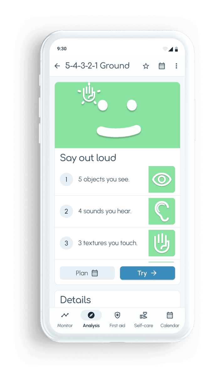
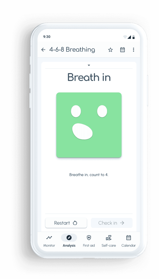
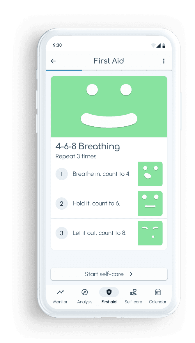
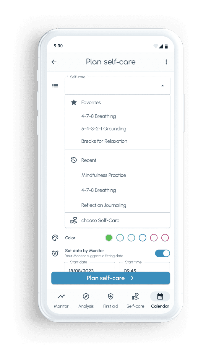
Defined a focused feature set (tracking, analysis, self‑care, crisis support, calendar‑based planning, standardized records) anchored in user research and reviewed by a psychiatrist.
Ran moderated usability tests with seven participants. All could complete at least one core task, and the tests surfaced where flows and wording needed to be clearer (especially feeling input, recurring self‑care, and first‑aid access).
Used test findings to redesign key flows such as mood recording, self‑care planning, and first‑aid, improving clarity, accessibility, and clinical reliability.
Created a style guide and design language tailored to anxious users via simple, non‑patronizing language, reduced visual complexity, considered color and iconography, which is ready for dev handover.
Broader transfer
Reinforced my practice of treating emotionally loaded domains as semantic design problems first: not just “what screens”, but what each term, scale, and color implies for people and professionals.
Sharpened how I bring personal experience into research-heavy projects: as a tool for empathy and rapport, while consistently cross‑checking decisions against user data and expert input.


Empathize
Understanding anxiety beyond symptoms
Purpose
Use my own history with anxiety as a starting point to connect and empathize, then deliberately widen the lens to understand how different people experience, manage, and talk about their disorder.
Approach
Conducted desk research on prevalence, diagnosis patterns, and system level issues such as long waiting times and societal impact.
Ran a survey with 43 participants to map goals, expectations, and desired app behaviors and features.
Conducted in‑depth interviews with four people with long‑term anxiety and panic disorders (11–20+ years) from different age and life contexts.
Synthesized findings into empathy maps to capture emotions, needs, and frustrations in a more structured way.
Desk Research
Most Common Mental Illnesses
1 in 5 women will experience anxiety disorders
1 in 10 men will experience anxiety disorders
chance to experience an anxiety disorder during lifetime. Source
Months of waiting time
40 % of patients wait 3 to 9 months for therapy after a first psychotherapeutic consultation.
Survey
Empathy Map
Do
control fears and try to live consciously
talk openly about disorder
apply coping strategies
Feel
distressing anxiety and symptoms
everyday problems due to anxiety disorders
disappointed by limited availability of therapy places and long waiting times
Need
emotional support and understanding
access to appropriate treatment and therapy
improved support systems and resources
secure and private communication channel
Encounter
lack of public awareness of anxiety disorders
shortcomings in the health system
challenges in setting boundaries and finding time for oneself
Key insights
Constant load
Anxiety showed up as a continuous, background presence with daily adjustments and strains, not only in acute episodes.
Session gap
People repeatedly mentioned forgetting events, triggers, and questions they wanted to discuss with their therapist, despite trying to write things down.
Care & action
Participants looked for tools that both normalize “it’s ok not to be ok” and provide concrete help in crisis (guidance, structure, techniques).
Health system gaps
Long waiting times and limited access to therapy increase the demand for reliable, self‑managed support before and between sessions.
Define
From generic “wellness app” to precise problem
Purpose
Translate broad emotional and systemic pain into a clear problem statement, value proposition, and initial product scope that can steer later design decisions.
Approach
Synthesized survey and interview findings into a concise problem statement and early product principles.
Defined initial product features (tracking, analysis, self‑care, crisis, calendar) by mapping them directly back to expressed needs and behaviors.
Created personas grounded in interview data, using empathy maps as an intermediate step.
Developed user journey maps for different personas, focusing on onboarding, day‑to‑day tracking, and critical moments.
Problem statement
Users diagnosed with or treated for anxiety disorders need a comprehensive digital tool to systematically monitor and manage their mental health based on identified patterns, in order to sustain and enhance the effectiveness of their therapy and ensure ongoing support in their mental health journey.
Persona


User Journey
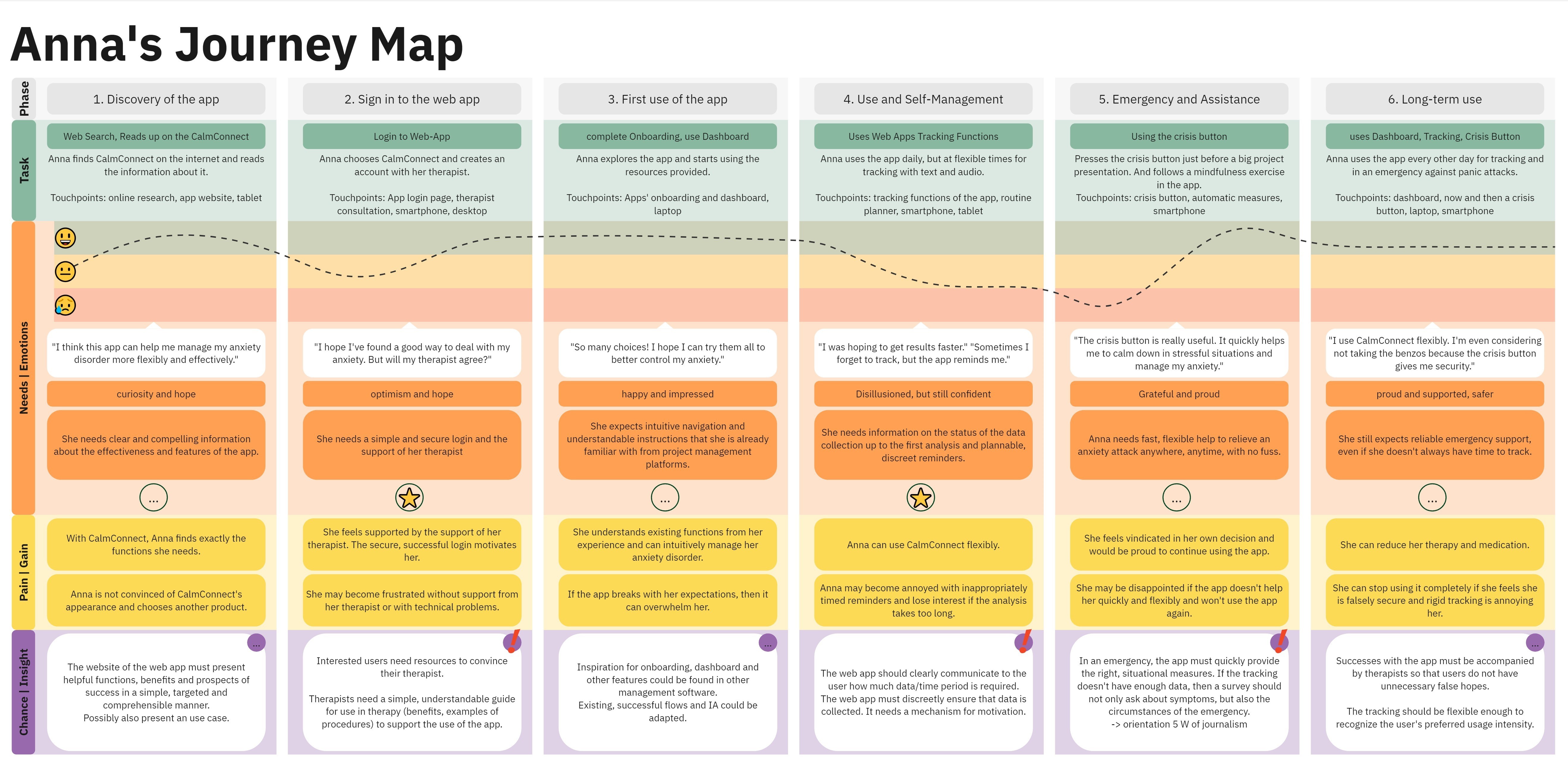
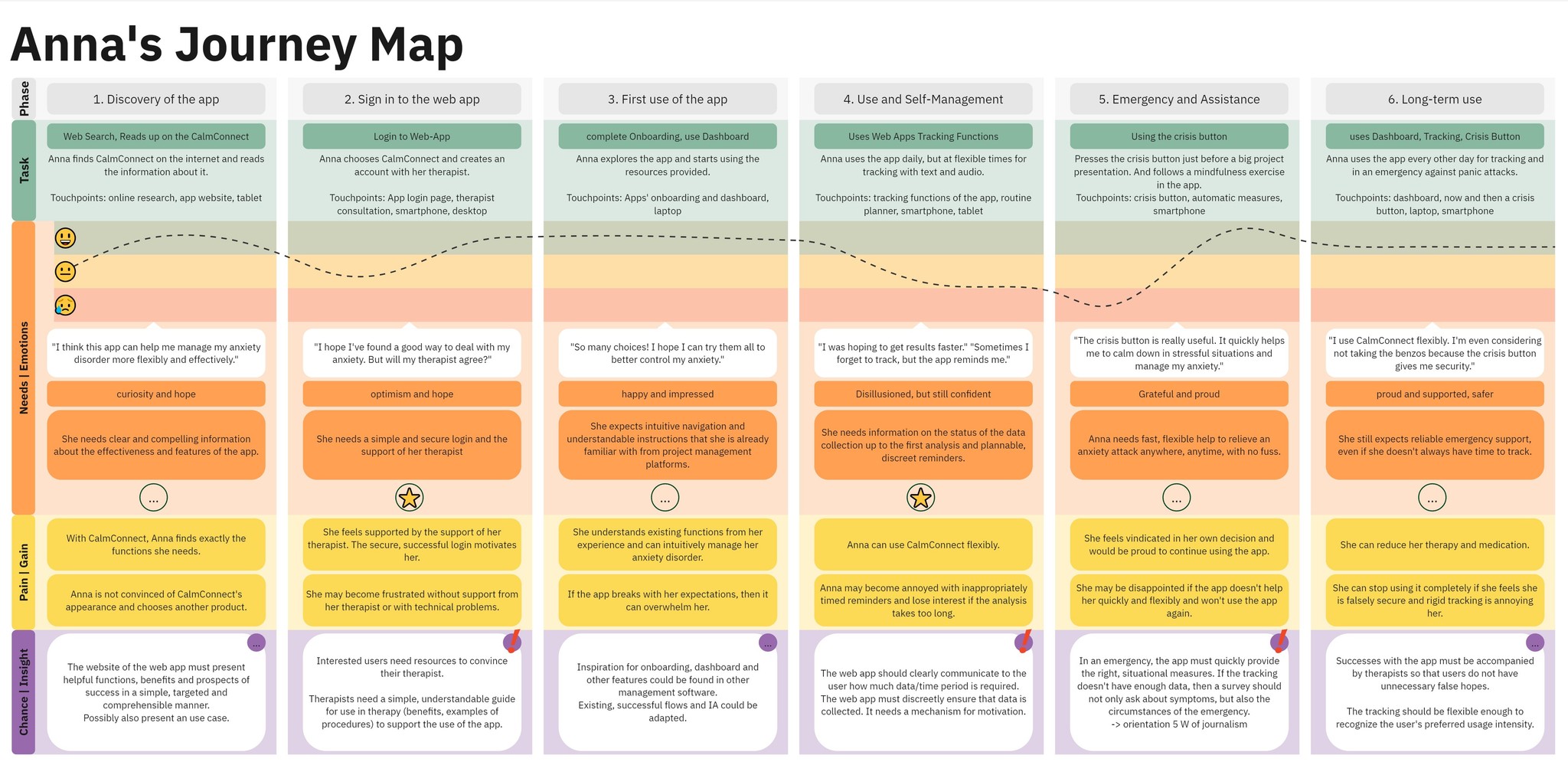
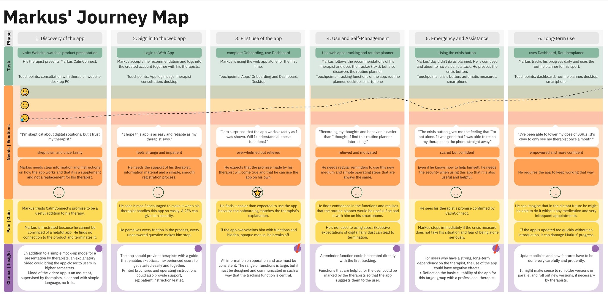
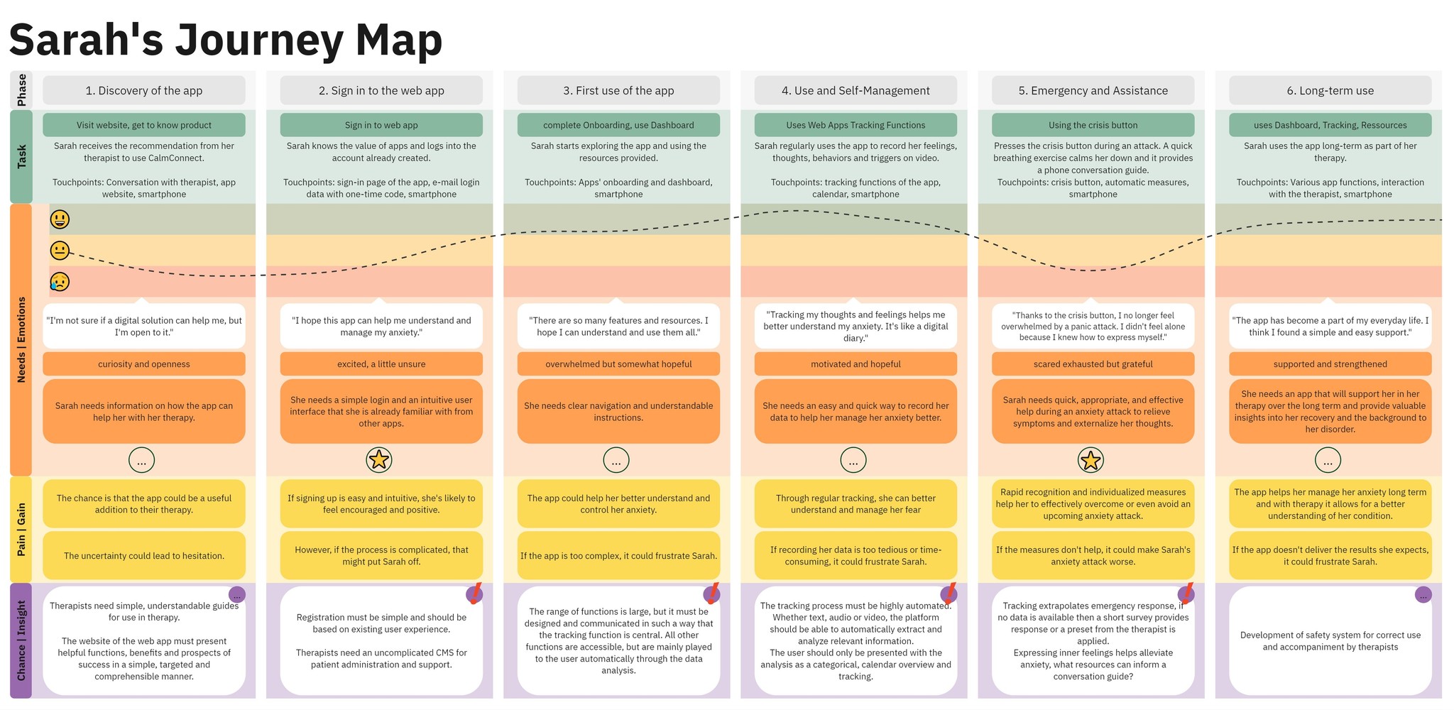
Key insights
Therapy companion
The product should explicitly support therapy, not position itself as a replacement or cure.
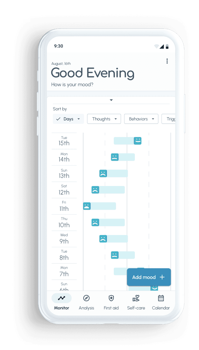
Patterns over snapshots
Long‑term patterns are more valuable than isolated feelings when it comes to both user self‑reflection and therapist conversations.
Critical moments
Tracking, capturing context and triggers, and immediate support during high‑stress situations became the backbone of the concept.
Simplicity as safety
For this audience, complexity reads as risk. Ease of use and emotional safety are core quality criteria
Ideate
Flow and IA for “ease in crisis”
Purpose
Design information architecture and flows that feel light in everyday use but remain usable under stress during early or acute anxiety episodes.
Approach
Defined user stories and flows from persona perspectives (e.g., needing fast, flexible help to manage an emerging anxiety attack while juggling family and work).
Created an initial sitemap and refined it using card sorting and alignment with user flows, focusing on keeping paths to core actions short and predictable.
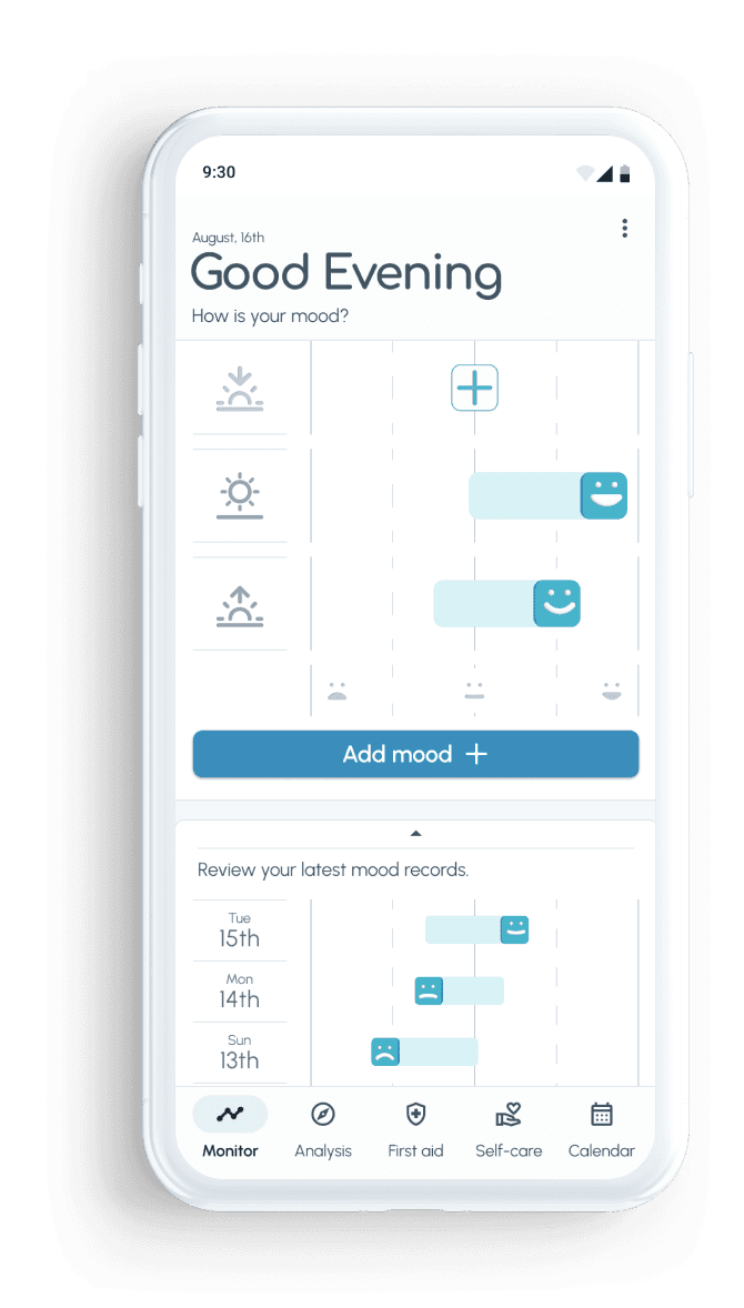
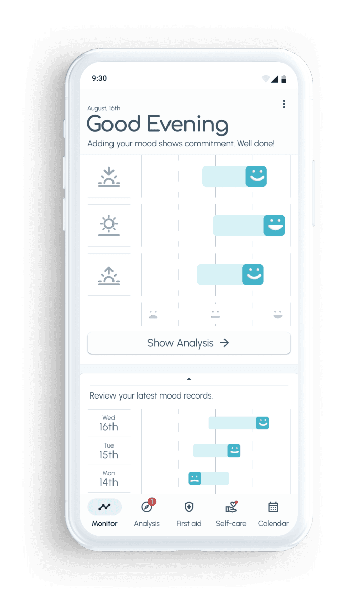
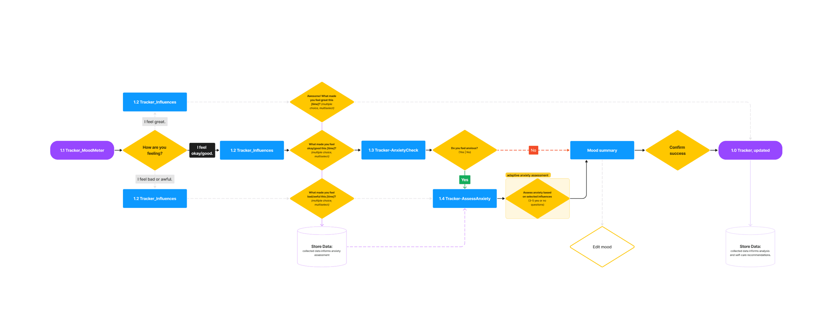
Made a deliberate decision to drop a separate dashboard and land users directly on the tracker screen to reduce cognitive overhead.
Sketched low‑fidelity wireframes to explore how the information architecture would feel when performing real tasks.
User Flows and stories


Navigation decisions
Low‑fi sketches
Results
Tracker‑first entry
Landing directly on the tracker aligned with primary user intent and reduced the steps needed to start logging.
Focused paths
Flows from logging to self‑care and first‑aid were designed as short, guided sequences rather than open exploration.
IA basis for testing
The resulting IA provided a clear structure to test later in the prototype, especially around how people move between tracking, calendar, and crisis support.
Prototype
From concept to testable prototype
Purpose
Move from sketches to a testable prototype that expresses the core concept, flows, and initial visual direction well enough for usability testing.
Approach
Built progressive prototypes in Figma, starting with low‑fidelity wireframes and moving to a mid‑fidelity clickable prototype based on Material Design patterns.
Translated key features (tracking, analysis, self‑care, crisis, calendar) into concrete screens and transitions.
Focused on clear hierarchies and straightforward layouts to avoid visual overload before any style refinements.
Mid‑fi prototype
The mid‑fidelity prototype expressed the core structure and flows across tracking, analysis, and self‑care well enough to evaluate task clarity without visual distractions.
Results
Right level of detail
The mid‑fidelity prototype was detailed enough to surface questions about flow, wording, and task structure without users getting stuck on visual details.
Assumptions to test
It highlighted assumptions, especially around crisis support and recurring self‑care, that I explicitly targeted in scenario‑based usability tests.
Test
Evaluating flows and interaction logic
Purpose
Evaluate how well the prototype supports users in representative tasks, and identify where flows, wording, or structure create friction.
Approach
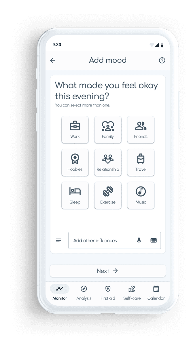
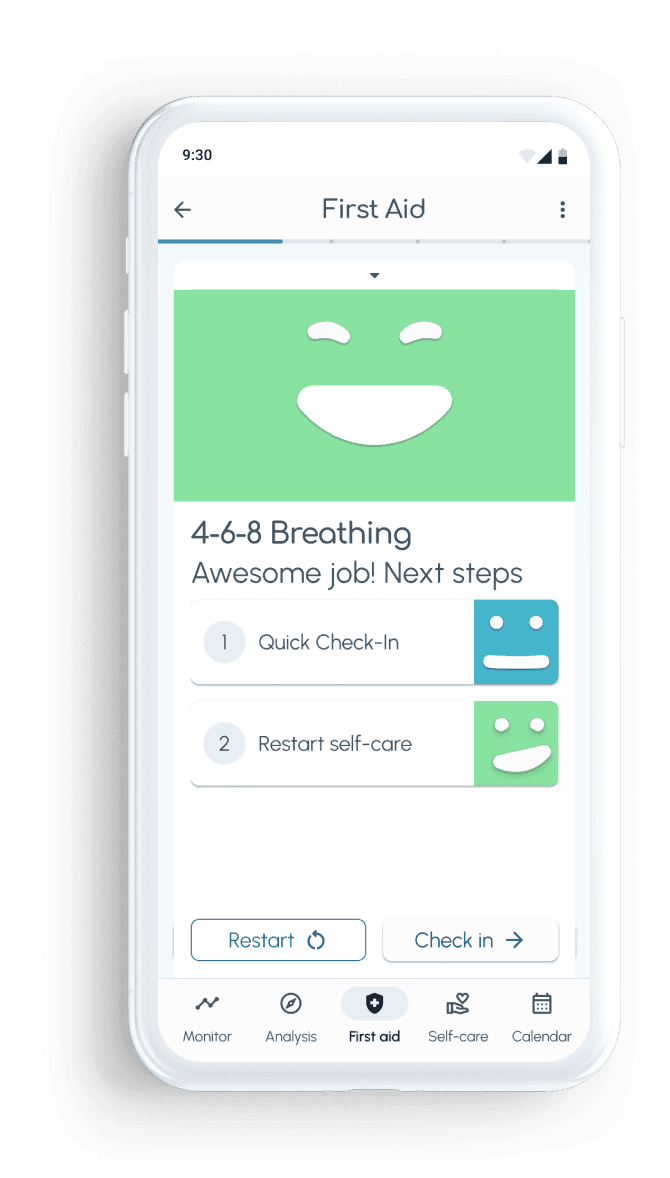
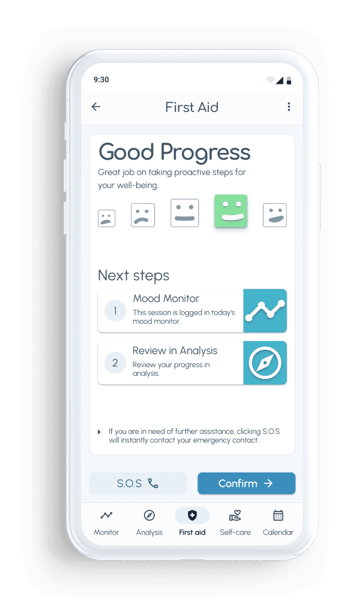
Designed three scenario‑based tasks covering adding a record and following self‑care, scheduling repeated self‑care, and getting first aid.
Conducted moderated usability tests with seven participants (25 - 40 y/o, relevant mental health history), each session lasting 9 - 20 minutes.
Collected both quantitative data (task success and satisfaction on a 0–10 scale) and qualitative feedback and quotes about clarity and emotional experience.
Analyzed issues by severity and frequency, using a rainbow spreadsheet to map them back to specific flows and UI elements.
Scenario test
Task 1
Add a record to the mental health monitor and follow a self-care.
Task 2
Use Mindflow to schedule a repeated self-care.
Task 3
Use Mindflow to get first aid in lowering your discomfort.
Task 1
7/7
successful participants
ease of use
satisfied
mean 7,6/10
Task 2
5/7
successful participants
ease of use
moderately satisfied
mean 7,1/10
Task 2
5/7
successful participants
ease of use
satisfied
mean 7,9/10
Key insights
Solid baseline, targeted fixes
Scenario tests showed that core tasks were generally achievable and well‑rated, while clearly pointing to improvements around feeling input, recurring self‑care, and first‑aid access.
Naming feelings is hard
Several participants struggled to identify and express their feelings, suggesting that the input model and language needed more guidance.
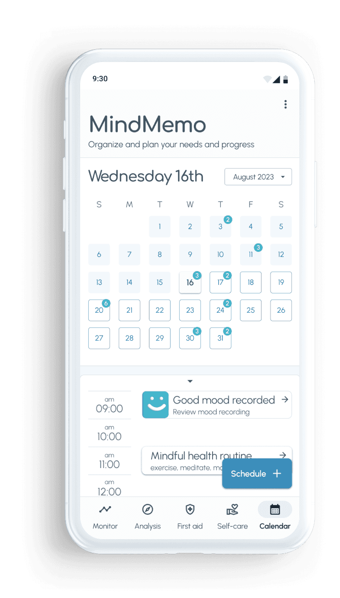
Clearer self‑care model
Repeated self‑care and calendar scheduling revealed mismatched expectations (e.g., time inputs), pointing to a need for a clearer mental model and flow, not just clearer labels.
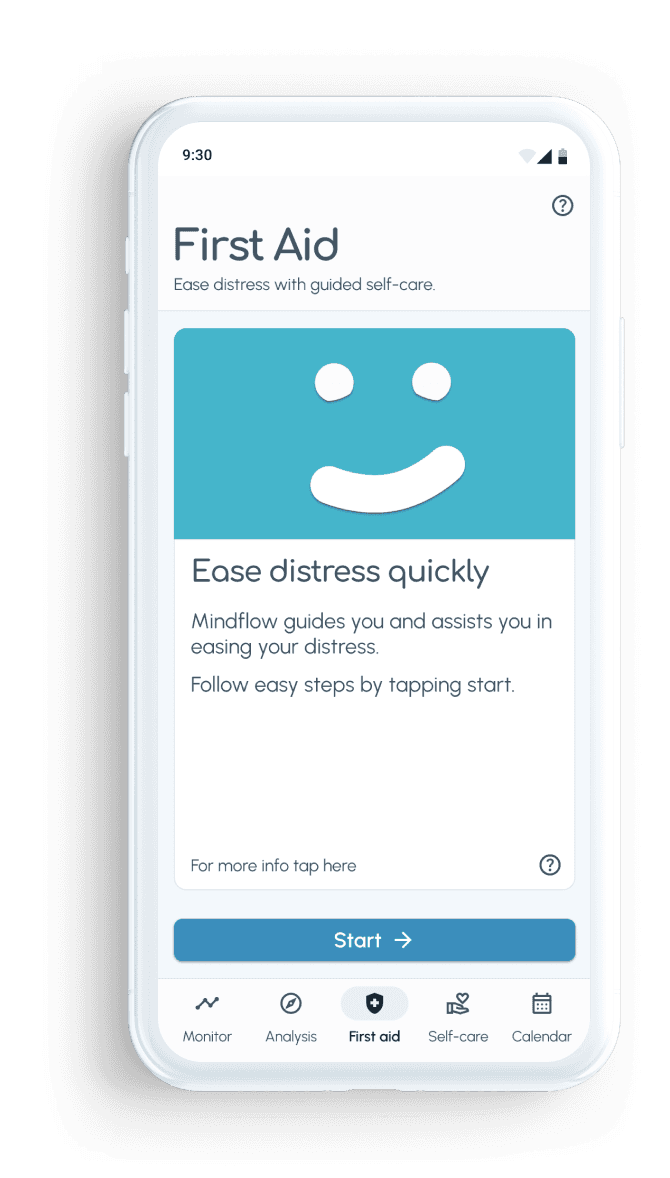
Reliable First‑aid
The first‑aid feature was perceived as helpful and intuitive in principle, but needed more explicit signposting to feel reliable in heightened anxiety states.
Iterate
Tightening flows, semantics, and visual language
Purpose
Turn test findings into concrete interaction improvements, establish a clinically robust assessment layer with expert support, and codify the resulting patterns into a style guide and design language.
Approach
Collaborated with a psychiatrist to redesign the mood recording and assessment flow, applying GAD‑7 and OASIS clinical scales in a way that fits mobile usage.
Simplified and clarified explanatory pages, introduced an input slider and contextual questions around feelings, and redesigned event planning for recurring self‑care.
Added a speed‑dial style approach for planning self‑care to make helpful actions faster to access.
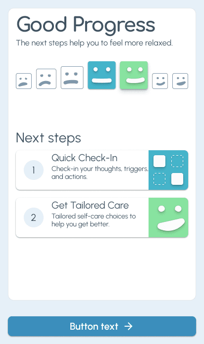
Refined the interface with clearer icons, considered color usage, and expressive, animated avatars to support comprehension and engagement at a glance.
Created a style guide and design language that reflects the needs of users with anxiety and is ready for development.
Iteration

initial Iterations: from paper wireframes to tested prototype
Revisited flow for tracking a mood

Final iteration for tracking a mood


Design language & system
Avatars


Color
Primary
#3B8EBC
Serene Spree
Primary color and shades to be used for buttons, backgrounds, typography.
Secondary
#8CD6E
Mindful Sky
Offers guidance as a neutral, non-judgmental reflection of the user’s mental state.
Mood Selectors
#88E3A0
Vital Verge
#F5B895
Coral Caution
Vital Verge and Coral Caution are only to be used to guide users’ interactions, like identifying and inputting a feeling.
Card Examples

Elements


Insights
Closer to intent
Adjustments to wording, question order, and navigation were grounded in observed test behaviour, bringing user actions closer to the intended flows.
Logs that support therapy
Combining standardized records with tailored self‑care suggestions created documentation that is easier to bring into therapy conversations.
Scales as backbone
Using GAD‑7 and OASIS with psychiatric review gave the assessment flow clearer meaning and stronger credibility for both users and therapists.
Learnings & Reflection
Clarity under stress
Designing for anxiety is designing for clarity under stress; semantics, interaction patterns, and visual hierarchy all need to hold up when people feel overwhelmed.
Lived experience
My lived experience with anxiety helps me build trust and ask better questions, but in high‑stakes domains like mental health I deliberately triangulate decisions with user research and clinical expertise.
Simplicity as professionalism
In health‑adjacent products, simplicity paired with validated instruments can feel more professional and trustworthy than complex, opaque interfaces.
Short learning loops
High‑stakes contexts benefit from short loops between research, prototyping, testing, and iteration. This keeps assumptions visible and correctable.
Design as pressure or relief
Visual and interaction design choices (language tone, density of information, pacing of steps) can either add to pressure or create enough calm for people to engage with help.
What I carry forward
Since Pawliday, I look for emotionally loaded moments, and then ask: what would it take, semantically and structurally, for people to feel safe saying yes again?
More works


Let’s talk.

Prefer a quick conversation? We can align on expectations, product context, and whether there is a good fit.
15 minutes