Health & Fitness
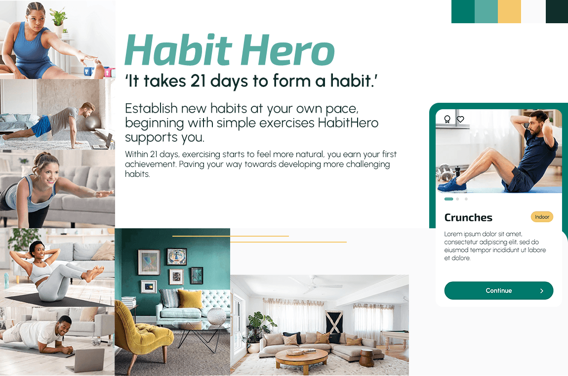
Habit Hero
ui-design
interaction design
Overview
Designing a fitness app UI that makes building a new habit feel human, not like surviving a “no pain, no gain” bootcamp.
Tools
Figma, Pen & Paper, FigJam, Adobe Creative Suite
Duration
3 months
Outcomes at a glance
Reframed the concept from a generic workout app into a 21‑day habit‑building experience for busy, beginner‑level users.
Defined a clear target audience and persona (Rebecca) that turned “people who want to get fit” into a concrete design focus.
Designed a distinctive UI language that avoids macho gym aesthetics and overly “cuddly” wellness clichés in favour of calm, inclusive motivation.
Mapped key user stories and flows, then translated them into a coherent set of low‑ and mid‑fidelity wireframes and final screens.
Delivered a clickable, dev‑ready prototype covering core journeys from onboarding through exercise discovery, scheduling, and progress tracking.
Challenge
Most fitness apps sit at two unhelpful extremes: testosterone‑heavy, performance‑driven experiences that intimidate beginners, or soft, feel‑good wellness products that still don’t solve real constraints like time and motivation.
For many people with busy lives, these products reinforce the idea that fitness is “for other people” and add guilt on top of an already fragile exercise habit.
I wanted to challenge these stereotypes directly and design an experience that makes room for people who are starting or restarting from a vulnerable place.
Objective
Design a UI concept for a mobile fitness app that helps time‑poor, intimidated users integrate short, flexible workouts into their daily routine and build a sustainable habit over 21 days. Within a three‑month project, the goal was to define the audience, key flows, and a visual language that could be handed over as a functional prototype.
Solution
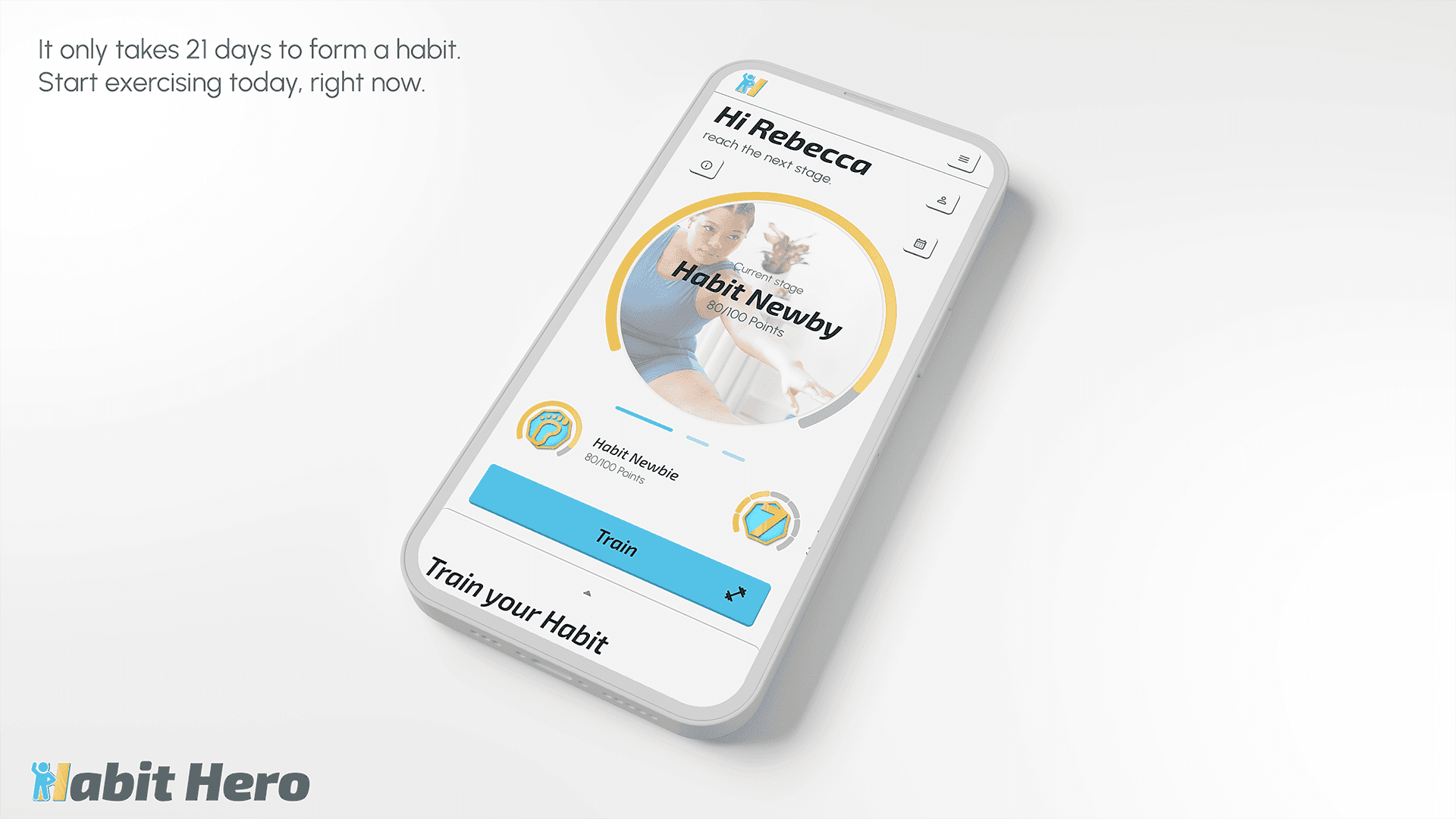
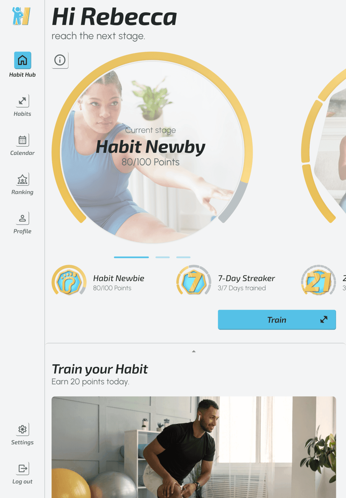
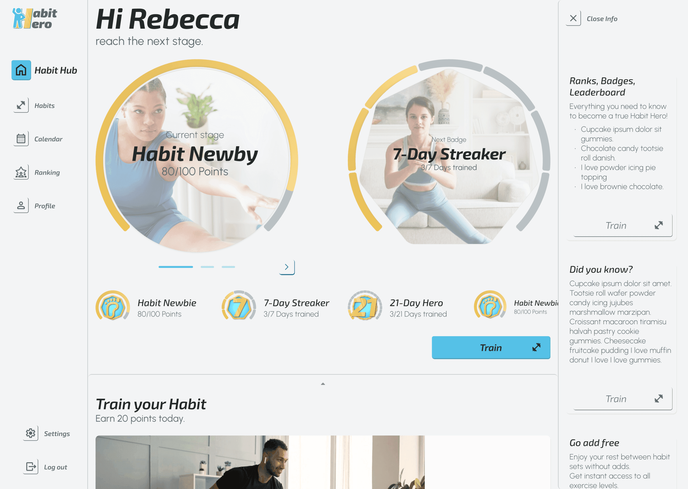
Habit Hero is a health and fitness app that treats exercise as a series of manageable steps towards a new habit, rather than a test of willpower or athletic identity.
It combines short, at‑home workouts, clear progression, and gentle gamification in a clean, approachable UI that feels achievable for beginners while still supporting long‑term engagement.
The app uses a 21‑day timeframe as a narrative anchor: enough structure to aim for, without turning the experience into another endless grind.


Outcomes & impact
Clarified the product’s focus from “workout app for anyone” to a habit‑building companion for busy, beginner‑level users who are often excluded by mainstream fitness culture.
Defined a concrete persona and target audience characteristics, giving a shared mental model of who the interface is really serving.
Delivered a coherent UI system and screen set that clearly differentiates Habit Hero from testosterone‑driven gym apps and overly “cuddly” wellness products.
Structured core flows (onboarding, exercise discovery, scheduling, and tracking) so that new and frequent users can move quickly from intent to action.
Produced a clickable prototype and supporting design artefacts (flows, wireframes, UI components) that are ready for handoff to development or future usability testing.
Broader transfer
This project sharpened how I read the language of consumer health products: the way an interface talks about bodies, effort, and failure quietly signals who the product is really for.
It reinforced a pattern I now reuse: when designing for behaviour change, I look for where stereotypes and guilt appear in the experience and deliberately design alternatives that lower intimidation rather than amplify it.

Discover
Why are habits so fragile?
Purpose
Understand why so many people, including myself, struggle to maintain a basic exercise habit even though the health benefits are obvious.
I wanted a clear picture of the stakes and the emotional reality behind “I know I should exercise, but I don’t.”
Approach
Reviewed public health sources on inactivity and the link between daily exercise and reduced mortality risk.
Visualized a key statistic showing how even 15 minutes of exercise per day can significantly lower overall mortality.
Conducted a competitive scan of fitness apps, focusing on tone, imagery, and motivational mechanics rather than feature checklists.
Desk research
Reduction in overall mortality (%) with increased physical activity per day (minutes).
„Regular physical exercise is great for preventing cardiovascular disease, high blood pressure, type 2 diabetes, cancer, osteoporosis, obesity, stress and burnout.“
Prof. Dr. Ingo Froböse, German Sport University in Cologne
Key insights
Knowing isn’t doing
Over 2 billion people are classified as inactive, while as little as 15 minutes of exercise daily already lowers mortality risk. Yet “knowing better” doesn’t translate into doing.
Failure feels personal
The emotional cost of “failing again” at fitness can feel heavier than the physical effort of exercise itself. “Breaking the habit” often feels like breaking a promise to yourself.
Fitness culture is narrow
Many competitors encode a narrow idea of who fitness is for: hyper‑fit bodies, competitive framing, or, on the other end, overly soft wellness branding that still doesn’t address habit fragility.
Define
Who are we really designing for?
Purpose
Translate the broad problem of inactivity and intimidation into a focused audience and a concrete person the interface is designed to help. This step should prevent the product from drifting back into “for everyone who wants to get fit.”
Approach
Created a detailed persona, Rebecca Johnson, a busy, beginner‑level software developer who wants to get in shape but struggles to fit exercise into her schedule.
Defined target audience dimensions such as busy lifestyles, simple start with gradual progression, accessible and enjoyable fitness, motivation through achievement, and users who are new or returning to fitness.
Persona
Putting a face to busy beginners

32 yo
Software Developer
in relationship, mother
tech-savvy
fitness beginner-level
Rebecca Johnson
“I love the thought of having something that could really work with my schedule. Being as busy as I am makes it tough to exercise otherwise.”
Goals
Lose weight and get in shape
Fit exercise into a busy schedule
Find enjoyable routines
Preferences
Flexible exercise scheduling
Fun and engaging routines
Achievement and reward system
Social sharing features
Needs
Short, frequent, flexible exercises
Clear instructions and visuals
Consistent motivation
Progress tracking
Constraints
Definition Target Audience
From ‘anyone who wants to get fit’ to a clear segment.
Busy Lifestyles
Users require exercises that fit seamlessly into their daily routines.
Simple Start, Gradual Progression
Users beginning with simple activities and aiming to build consistent habits.
Accessible and Enjoyable Fitness
Users seeking a stress-free approach without "no pain, no gain" mentality to a healthy lifestyle.
Motivation Through Achievement
Users attracted to trackable achievements and social sharing.
New or Returning to Fitness
Users starting or re-engaging with exercise, needing manageable options.
Key insights
Time, guilt, self‑doubt
Users like Rebecca aren’t missing information, but they are juggling time, family, and work, while feeling that most fitness products aren’t meant for them.
Visible and manageable progress
Short, flexible exercises, clear instructions, and trackable achievements are not “nice to have”, but they are necessary to keep beginners engaged.
Social, not shaming
Achievement and sharing can motivate, but only if they don’t turn into another comparison arena that highlights how far behind users feel.
Develop
From motivation to first workout
Purpose
Design flows that connect Rebecca’s goals and constraints to concrete paths in the product without overwhelming her.
The aim was to make the path to the first successful workout and subsequent routines as straightforward as possible.
Approach
Sketched an initial user flow starting from the first thought about the target group, through onboarding, workout discovery, and tracking.
Wrote user stories for new users (finding at‑home exercises, learning about different options) and frequent users (tracking achievements, progression, challenges).
Used these stories to guide the structure of the flow, ensuring each story had a clear route through the interface.
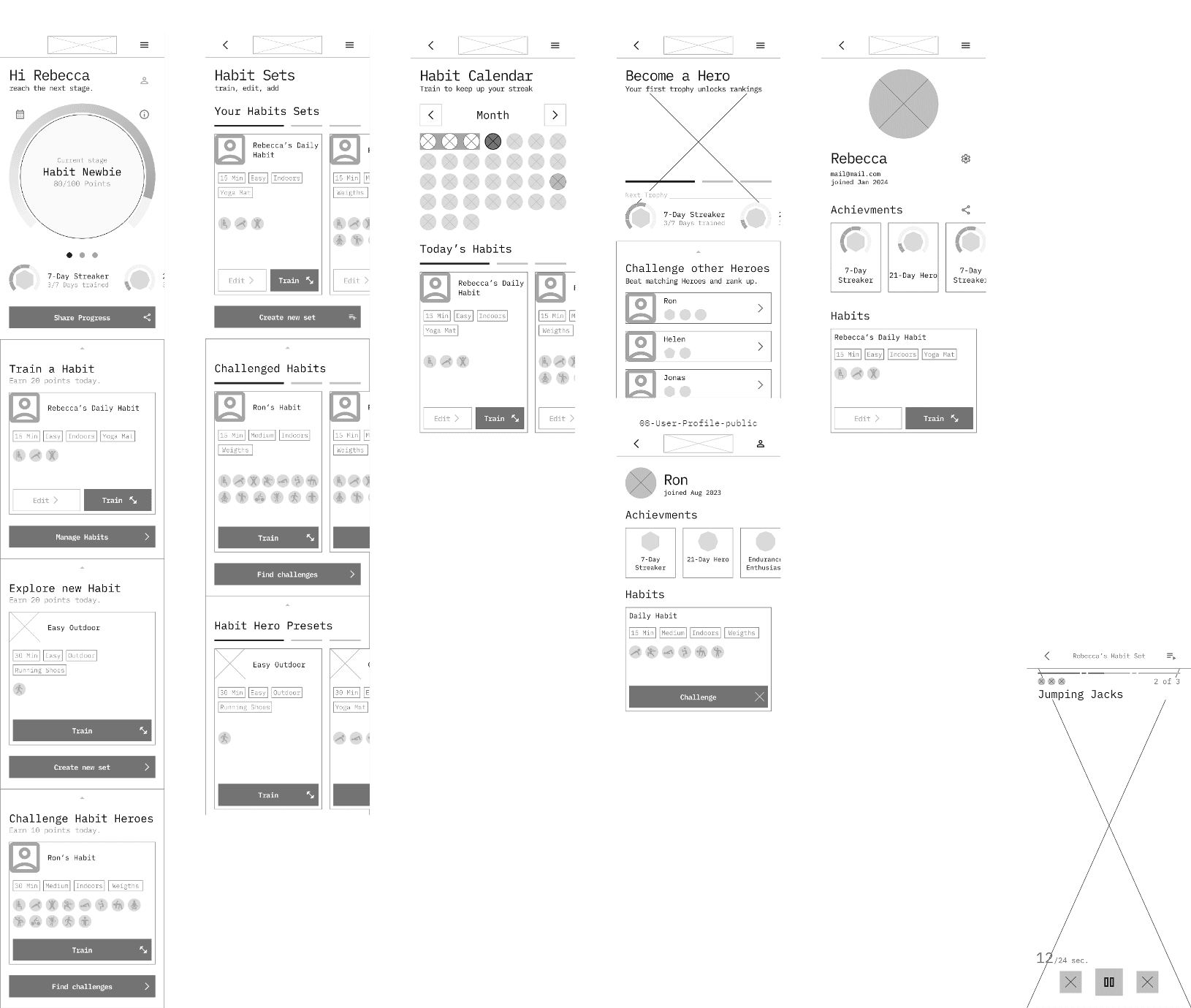
Translated the flow into low‑fidelity wireframes to explore layout and navigation without visual distraction, then iterated into more refined versions.
User Stories
As a new user I want to be shown how the exercises are done, so that I know I’m doing them correctly.
As a new user I want to learn about different exercises, so that I can figure out what is best for me.
As a frequent user I want to be able to earn achievements or rewards, so that I can stay motivated.
As a frequent user I want to track progression and record what I’ve done, so that I can see my progress over time.
First User Flow Sketch
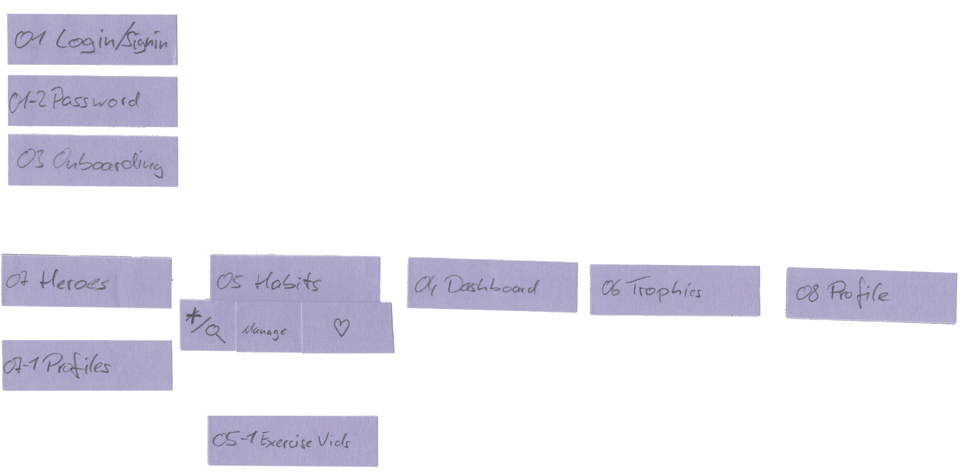
Low-Fi Wireframes

User flow revisited

Mid Fi Wireframes
Results
First workout, zero friction
The flow for new users must minimise decisions between opening the app and starting a workout; every extra step risks losing them.
Continuity over novelty
Frequent users primarily want to see where they are in their progress, what they’ve done, and what they can do next to stay on track.
Deliver
Visual system and prototype
Purpose
Create a visual language that feels inviting and trustworthy for beginners, and package the design into a prototype that is ready to hand over to development or testing.
Approach
Designed a clean, modern interface with a focus on meaningful habit‑building and progress, intentionally avoiding stereotypical “pushy” fitness visuals.
Defined core feature areas in the UI: user‑friendly navigation, gamification, and ease of use.
Implemented gamification elements (badges, leaderboards, challenges) in a way that supports motivation and progression rather than pressure alone.
Ensured the app supports quick access to exercises, clear video guidance, and simple tagging and filtering to fit busy schedules.
Assembled the final screens and interactions into a functional prototype ready for development.
Moodboards
Design Approach
Neumorphic UI for a tangible, natural experience with warm neutral colors and energetic accents to create comfort.
A neuphormic style adds a tactile-visual quality fitting the physicality of sport.
But this quality is lost on desktop and it's challenging to be developed.
Design Approach
Flat UI to emphasize clarity and straightforwardness with muted yet distinct colors to promote tranquility and focus.
The flat approach better suited the user goals: readily available, quick, distraction-free exercises.
But the colors felt too rigid and corporate, possibly because they are already used by the brand John Deere.
UI Elements
Modern | Precise | Warm
Clear | Calm | Minimal
Typography
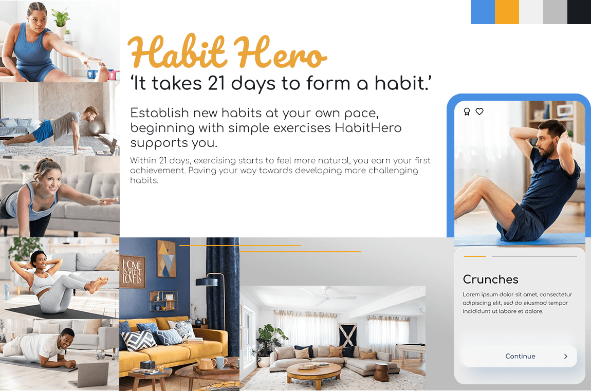
Typography balances encouragement with clarity: Exo 2 italic gives headlines a modern, approachable energy, while Urbanist keeps body text calm and highly readable. This pairing supports quick scanning in busy contexts without slipping into either cold tech or soft, unfocused wellness.
Color
The palette leans on daybreak hues: Seagull blue for calm orientation and trust, Sunglow yellow for warm, optimistic energy. Together they avoid aggressive ‘gym’ colors, creating a gender‑neutral, non‑threatening environment for beginners.

Elements
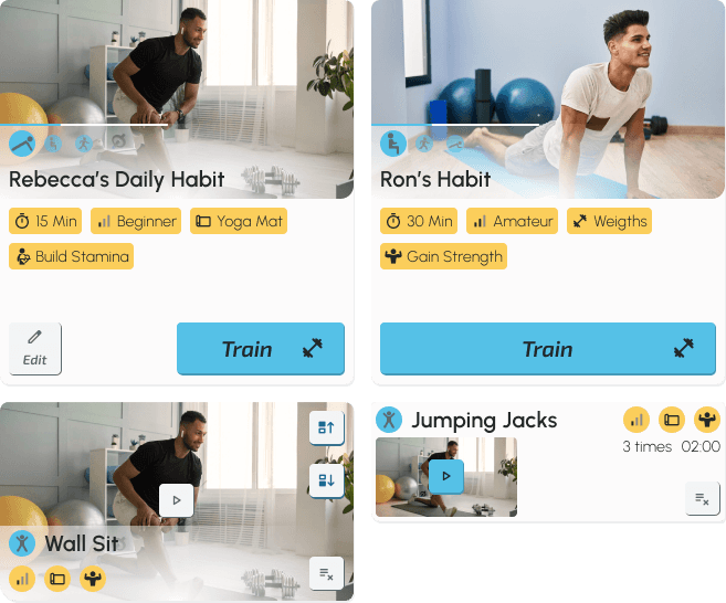
These card‑based UI elements surface tags, video previews, and primary actions at a glance, reducing reading effort and decision time. They’re designed for quick, low‑friction engagement so users can fit workouts into a hectic day.
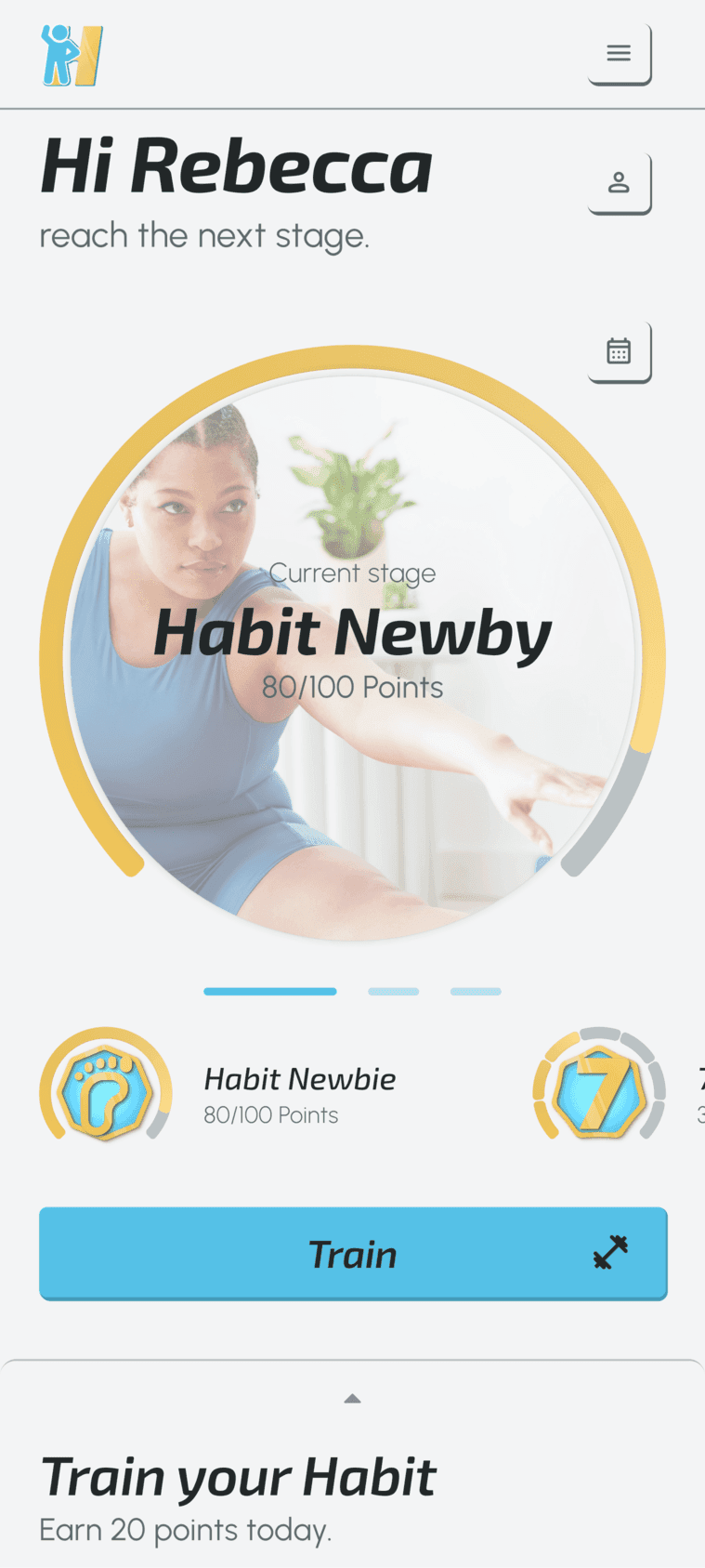
Badges
The badge system focuses on visualising consistency and small wins rather than raw performance. It’s designed to reward ‘showing up’ and foster a sense of progress and belonging, especially for users restarting their fitness journey.

Habit Hero's eased animation
Common linear animation
Reward animation, achievement Habit Hero
Onboarding loop depicting progression system
Animations
These eased, slightly elongated animations make interactions feel smooth and encouraging instead of urgent or demanding. Motion supports the fragile early phase of habit‑building by celebrating progress without adding pressure.
Adjusting for wider breakpoints
Habit Hero is mobile-first, but to ensuring a seamless experience for larger screens the design follows a grid base of 4 and exactly defined column layout.
Prototype
The mid‑fidelity prototype expressed the core structure and flows across tracking, analysis, and self‑care well enough to evaluate task clarity without visual distractions.
Results
Visual tone sets who feels welcome
Moving away from hyper‑intense gym imagery and soft, generic wellness visuals creates space for users who don’t see themselves as athletes yet.
Gamification should feel supportive, not punitive
Badges, levels, and challenges can drive engagement when they celebrate consistency and effort instead of punishing missed days.
Learnings & Reflection
Semantics decide who feels welcome
Habit design is semantic: how an app speaks about effort, failure, and bodies quietly decides who feels welcome to try again.
Protect the fragile start
Early habit stages need protection, not pressure. The first weeks should feel like a supported experiment, not an exam users are doomed to fail.
Visual clichés are not neutral
Six‑packs, hardcore dashboards, or pastel “self‑care” fluff all encode values. If left unchallenged, they exclude exactly the beginners this product is for.
Respect cognitive load
Designing for busy people means respecting their cognitive load: Short flows and clear next steps matter as much as beautiful screens.
Aligned gamification only
Gamification works when it reinforces intrinsic motivation and consistency. Badges and challenges should reward showing up, not just outperforming others.
Persona as semantic anchor
A single, well‑defined persona can act as a strong semantic anchor, preventing the product from drifting back into “for everyone” vagueness.
More works


Let’s talk.

Prefer a quick conversation? We can align on expectations, product context, and whether there is a good fit.
15 minutes